Building an interactive map for evaluating rooftop solar
Dan Murphy, June 1 2023

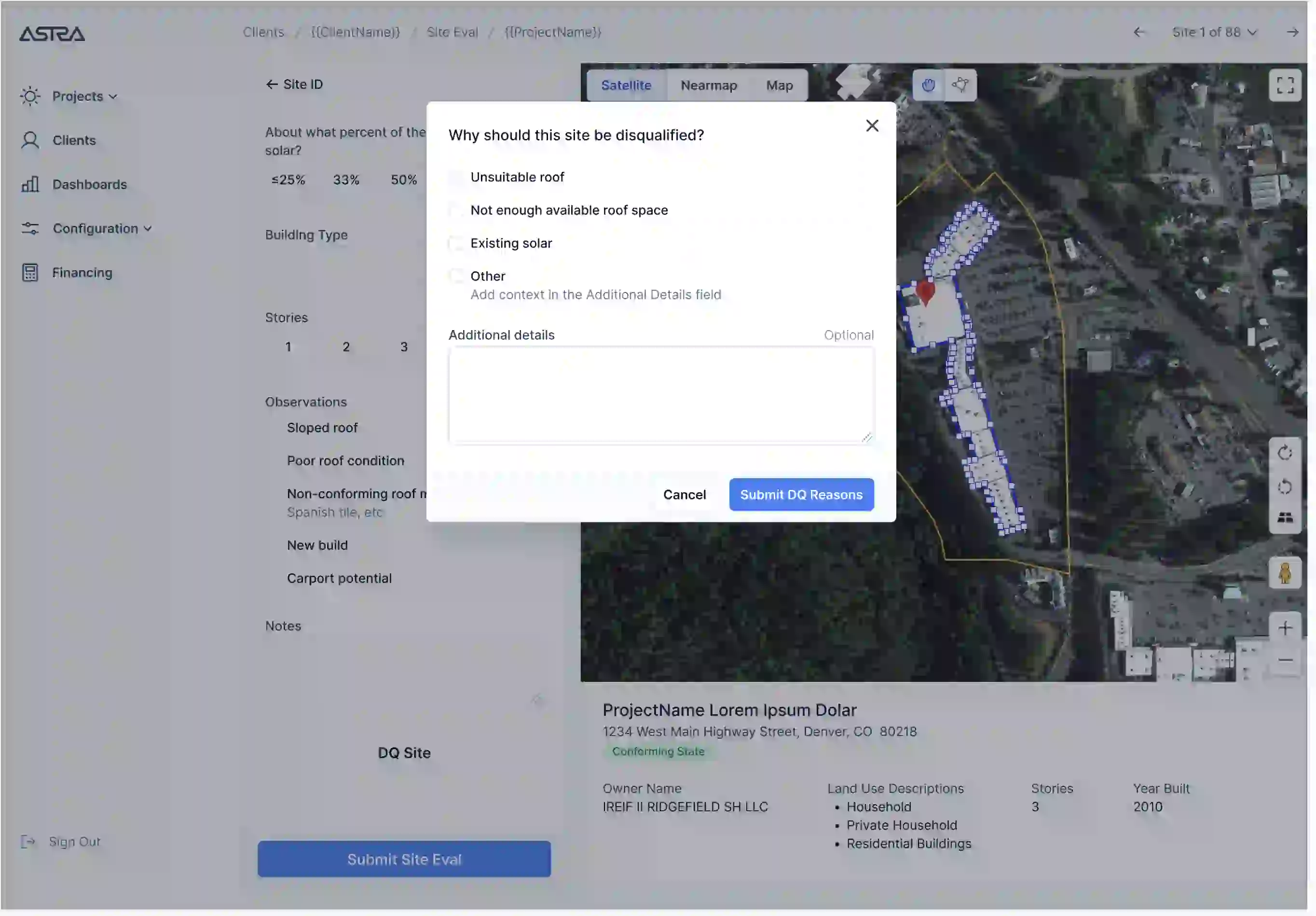
An early prototype of the map. Some proprietary info redacted.
The problem
Wunder Capital is a commercial solar developer known for their technology-first approach to deploying solar across large portfolios of properties.
When I worked for Wunder we needed a way to quickly evaluate portfolios of hundreds of properties to see which of those locations could benefit from a solar installation. This evaluation involves many aspects of the property including the:
- Usable (unobstructed) roof size
- Level of shading on the roof
- Estimated power consumption of the building
- Estimated cost of purchasing power from the local utility (this varies based on the timing and magnitude of consumption)
The results of this analysis are key to Wunder’s ability to estimate how much energy they can expect the solar system to produce, and what they can expect the economic value of that energy to be.
The accuracy of those estimates is crucial to Wunder’s ability to make reliable proposals to clients and to ensure projects are profitable. The speed of those estimates is key to delivering an exceptional experience to their customers.
Full automation
When researching potential solutions to this problem the first thing that came to mind was certainly not building an interactive map that users would manually interact with.
We already made use of a number of tools for manually evaluating rooftop solar potential, such as Helioscope.
While those tools were great for producing the extremely high fidelity system designs needed to actually proceed with construction on a site, they were prohibitively slow in the case where we only wanted to get a rough sense of the economic viability of a large number of sites very early on in the project lifecycle.
An evaluation with CAD (computer aided design) software like Helioscope could take 30 minutes or more per site as the user would need to draw the different slopes, levels of shading, and obstructions on the roof by hand.
We needed something much faster, and we knew of services that would allow us to send a list of site addresses and receive back an estimate of the buildable system size the roof could support.
A fully automated site evaluation system provided as a service, what could be better than that?
So we built a prototype to test an integration with one such service out. As we had hoped, the results did come back nearly instantaneously and with a minimum of code to maintain on our end.
But while this system was undeniably fast, spot checking its results revealed that it was also unacceptably inaccurate when compared to the high fidelity system designs produced by Helioscope.
Chief among its problems was its inability to correctly identify the properties associated with the site address provided by the client. Sometimes the system would mark a small shed or booth as the rooftop, rather than the adjacent large warehouse that was the intended target. In other cases the system would mark an entire strip mall building, when only a subset of that building was owned by the client.
It was also not uncommon for the system to associate the site address with a location that didn’t contain any buildings at all, such as the middle of a road or forest. The underlying technical issue in that case is one of geocoding, which is the process of translating an address to a pair of latitude, longitude coordinates that can be located on a map.
Geocoding is not a foolproof process. Different geocoding systems can produce different latitude, longitude coordinates for the same address and there is no guarantee that the coordinates actually do point to the location you’re interested in.
Consider a multi-family housing complex. If you enter an address with a detail such as “Apartment #3” into a geocoding system, you may find that the map centers not over apartment #3, but over the middle of the complex, the parking lot by the street, or some other unit.
After exploring this prototype it became clear that correctly identifying the buildings associated with the site address was a prerequisite to making accurate estimates about the solar viability of the site, and as best we could tell a fully automated system could not make the nuanced judgement calls necessary to achieve that goal.
A hybrid approach
To remedy these issues I built a custom site evaluation map powered by the Google Maps JavaScript SDK. The goal of this solution was to strike a balance between accuracy and speed by combining manual site identification with as much automated calculation and data entry as possible.
With this solution, after uploading a list of site addresses to the system, a user can click through a carousel containing a map for each site. Every map auto-populates with several key pieces of information from third party providers of geographic data APIs:
- A marker centered over the location associated with the address for that site. Under the hood this used the Google Geocoding API.
- Data about that parcel of land such as its boundaries (shown as a yellow box on the map), the name of the owner, number of stories, estimated total building square footage and building classification (warehouse, apartments, etc). This data was obtained from a third party provider called ReGrid, which wraps publicly available legal data in an API.
- Aerial imagery provided by Nearmap as a higher-fidelity and more frequently updated alternative to the default Google satellite imagery.
- Boundaries for all of the buildings contained within the parcel (drawn as blue boxes on the map), obtained from a number of different third party providers, along with the area square footage of those boundaries. These boundaries made it easy to calculate the square footage of building roofs using the Maps SDK’s geometry library.
This auto-populated information is a powerful starting point for the user doing the site evaluation, particularly in terms of identifying the correct structures to evaluate. This initial view makes it easy to answer questions such as:
- Does the legal owner of this land correspond to the client who sent the site address?
- Are there structures contained in the legal parcel that likely shouldn’t be evaluated, such as sheds and booths?
- Are there structures not contained in the legal parcel that appear to be part of or related to the structures within the parcel?
This data could also be automatically fed into Wunder’s infrastructure for calculating some of the key data points mentioned above. For example the type of building and estimated building square footage are used to estimate the power consumption of the building.
Fine tuning
Mockup exploring an interface for users to supplement or adjust the auto-populated map data.
But the real power of the map is in the user’s ability to refine or completely replace the auto-populated data. In the case of bad geocoding, let’s say the marker got placed in the middle of a pond or forest, they can move the marker to a more appropriate location.
Each time they do this the map automatically fetches the legal data and draws the parcel and building boundaries for the new location of the marker.
This makes exploration and adjustment very easy. Maybe the initial geocoding actually seems reasonable at first, but the user wants to see more info about the adjacent parcels. Are those parcels also owned by the client? Should those sites be evaluated even if they aren’t in the list of site addresses?
Once satisfied with their structure identification the user is required to provide a rough estimate of how much of the roof area is usable for solar. This step accounts for obstructions such as HVAC equipment, shading, and other nuanced factors I won’t cover in detail.
While the user can edit, delete or draw completely new building boundaries in cases where the auto-drawn boundaries are not acceptable, in practice it was much faster and nearly as accurate to simply apply these rough usable percentage estimates to the auto-drawn boundaries.
How do I know that’s the case? From running user tests. The tests compared the speed and accuracy of site evaluations done via this rough estimate approach against those made by a version of the map where users needed to draw highly detailed outlines of every structure by hand. This second approach was similar to a lightweight version of the CAD process described earlier, with the key difference that because it was implemented in custom code it was easy to detect and measure every user interaction within the map. That data made it easy to see exactly what the difference between the two approaches was in terms of time and accuracy.
Unsurprisingly the manual draw-by-hand process was much slower (imagine a multi-family housing complex with dozens of buildings), but unexpectedly it was also not appreciably more accurate. This made it clear that having users simply enter rough estimates of the usable percentage of the roof would provide the desired balance of speed and accuracy.
Apart from speed, another major advantage of this approach over third party modeling tools like Helioscope was its ability to surface data about the site evaluation process.
All of the user-driven edits to the map are persisted in a database: the position of the marker, any building outline adjustments, the roof usability estimates, etc. This makes reviewing and sharing the results of the site evaluation easy, either manually or programmatically.
As a result a manager can directly see how the user was thinking about the site, which structures they thought were relevant, and how usable they thought the roof was.
Similarly, a data analyst or product manager can easily run queries against these results. Want to see how often the auto-drawn polygons are adjusted versus kept as-is? No problem. Curious about the average estimated usable roof percentage? Easy enough.
Less is more
The solution arrived at for this problem, at least to me, was not obvious at first. Often our instincts in software are that more automation is better. But automation is only as useful as the quality of its results.
The user tests made clear that, at least in this particular case, less automation was better. The real value add was supporting people in making nuanced judgement calls. This was done by providing convenient access to contextual data, automating data entry and creating a persisted record of the analysis that could easily be reviewed or shared.
You’ll notice I’m not saying much here about the technical side of things.
How was the code structured? How did the API integrations work? What about the data model?¹
Certainly those details are important, but as with any software the key thing to focus on is the problem facing the business and the ways in which the software address that problem.
Radiant Software’s primary concern is always pragmatic problem solving, and in keeping with that I’ve focused this post on just that, rather than the technical implementation.
Could your business benefit from expert software engineering, product development or team building? Get in touch at hello@rdnt.software or visit https://rdnt.software/ to get started.
Radiant Software builds exceptional digital products using Ruby on Rails, React, Node.js, Python or your technology of choice. We can accelerate your product development process with rapid prototypes, A/B testing, and analysis of technical feasibility. Or leverage our experience to level up your engineering team with technical interviewing, mentorship, and training in modern software development practices.
Footnotes
- Briefly: the code is a combination of TypeScript and server-rendered data powered by Hotwire. I leveraged the Google Maps SDK’s event driven architecture to fire the appropriate API calls as the user interacted with the map. Building boundaries are stored as JSON arrays of latitude, longitude coordinates. Such coordinates are easy to render on screen via the Google Maps SDK. While Wunder was using a database (Postgres) that can support geometric types such as Points and Polygons, it was easiest to use JSON because that was a format that the Maps SDK and our third party data providers already understood (AKA no translation from Postgres data structures was required to interact with those tools).