Metrics are conceptual compression
Dan Murphy, April 14 2024

Wait, aren't there thousands and thousands of mortgages in each of those?
To put it bluntly, the discipline of economics has yet to get over its childish passion for mathematics … at the expense of historical research and collaboration with the other social sciences. This obsession with mathematics is an easy way of acquiring the appearance of scientificity without having to answer the far more complex questions posed by the world we live in.
- Thomas Piketty
Way back in the long long ago I wrote a post about how start-ups can take their first steps towards establishing a system for analyzing their data. An analytics database, a query interface, maybe some data pipelines. You know, infrastructure.
But perhaps I was getting ahead of myself. Building infrastructure is all well and good, but what’s the point if we aren’t sure what to do with it?
So I’ve written a series of posts, of which this is the first, offering some guidance in that realm: how should we think about our data? How can we glean real insight from it, and how can we make it harder to draw wrongheaded conclusions?
I’m not a statistician and these few short blog posts aren’t going to make either one of us into one. We won’t be constructing posterior distributions or digging up formulas from your old statistics class. Those are worthwhile endeavors, but not ones suited for short-form posts from a dubiously qualified author.
Instead I’ll share some high-level, very practical lessons I’ve learned for dealing with data, with the hope they give you more direction and confidence when you want to make sense of the numbers at your disposal.
These posts are centered around metrics, which I’ll define as numbers organizations use in an attempt to gain understanding or create incentives.
There will be four posts:
- Metrics are conceptual compression - Metrics almost unavoidably reduce the amount of information available. This has both positive and negative implications.
- Metrics are incentives - People love to set targets, people love to hit targets. What will they do to hit those targets? Is it what you want them to do?
- Metrics are persuasion - Metrics created and interpreted by medical doctors, scientists, and economists are often misleading. Are you sure yours are fine?
- Metrics are powerful - After three posts of me telling you how dangerous and hard to get right metrics are, I tell you metrics are sometimes very useful. With great power comes great responsibility, as they say.
Conceptual compression
David Heinemeier Hansson (DHH) often writes about conceptual compression. This is the idea that over time we can make increasingly complex topics accessible to increasingly novice people through the power of abstraction.
On some brokerage websites if you want to buy a stock, they will list a price and you can click a button to buy at that price.
Nevermind that the actual exchange upon which that stock trades doesn’t have some fixed price. Instead different parties are asking to sell at and bidding to buy at different prices, according to different rules and trading strategies, and middlemen facilitate transactions between these parties. You can offer to buy at a given price, but there’s no guarantee you’ll find a willing partner and there’s certainly not a single authoritative set price.
The consumer brokerage has offered its users conceptual compression: don’t worry about bidding and market making and trading hours and limit orders and trading volume and… just press a button and buy at a set price.
The brokerage has hidden some of the nuance of the transaction in order to make it more accessible and more easily understood in broad strokes, and crucially - to make it less of a pain in the ass. They have created an abstraction that says “at any given time there is an agreed upon price for a stock, and you can buy or sell at that price.” The abstraction isn’t true, but it’s very useful if you want to make it easy for people to buy and sell stocks.
There are countless examples like this in the modern world, particularly in programming and finance. As DHH writes, a programmer once upon a time had to be intimately involved with how their program managed memory usage. There was much manual effort to make sure it was done well. Anyone who’s written a smidgeon of C knows how easy it is to mess up manual memory management.
And so modern programming languages handle this for you. You don’t have to think about allocating and freeing blocks of memory.
Is this good? Is this bad? It’s a little of both, depending in large part on the quality of the abstraction.
When you “swipe right” on someone in a dating app you are interacting with an abstraction of that person, a facade that purports to convey the essential information and nothing else. I think anyone who’s used a dating app can attest to the fact that there is indeed something useful or interesting about it: how else could you attempt to “match” with so many different people so quickly and conveniently?
I’d also venture than anyone who’s used a dating app would quickly point out the shortcomings: the person who wasn’t quite what their profile portrayed, the date where it was immediately apparent the chemistry wasn’t there, in short - all of the times the interaction between two real, complex, messy people, wasn’t accurately simulated by a poor abstraction.
That being said I tend to agree with DHH: over the long run, more conceptual compression tends to be better. Over time we get the abstractions increasingly right. Doing so frees us from trying to hold a million little details in our heads, so that we can use our limited mental energy on the big picture we care about rather than on the minutae of how it’s all working under the hood.
What are you missing?
Metrics are often a form of conceptual compression, attempting to summarize or serve as a proxy for some larger, more complex thing.
Take inflation as an example. It’s a measure of how prices are changing in the economy, but it has a tough job: boil all of those price changes down to a single number.
The Nobel Prize winning economist Thomas Piketty discusses just how hard this job is in his magum opus Capital in the 21st Century. Piketty was analyzing the long-term historical trends for economic indicators like inflation, and as a result had to deal with the messy reality underlying the simple seeming number.
Which products are included in the measure of inflation? What happens if some of those products cease to exist, or new ones are introduced? How are changes in quality accounted for? If a bicycle in 2000 costs twice as much as a bicycle in 1900, but the bicycle in 2000 is lighter, faster, more comfortable, and more durable, how do you compare the two?
In short, the metric is missing much of the complexity inherent in the thing it was meant to summarize. This is both good and bad!
It’s good when you need to succinctly communicate how prices in the economy are changing over a relatively short period of time. You could imagine a policymaker, financier, or business owner finding it very useful to read “inflation averaged 6% over the last 4 quarters”.
It’s bad when you need to deeply understand the underlying reality being described by the metric. If you wanted to understand how the affordability of cars or bicycles changed you’d want to look at more than just the change in price. You’d also care about the quality and capabilities of the products, the income of consumers, and the competitive landscape surrounding the production of those products.
Distributions
When talking about metrics one of the most common forms of conceptual compression is the omission of the shape of the underlying data set or probability distribution.
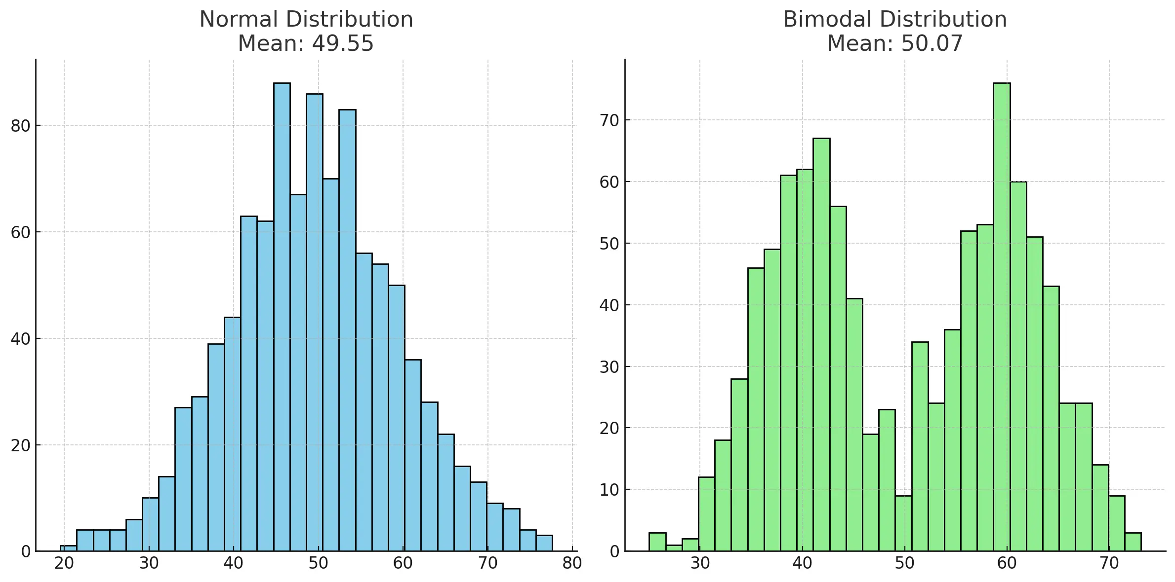
Let me show you. Below are two made up data sets:

Same mean, different distributions.
They both have a mean (average) of roughly 50. But clearly they are very different bodies of data. The normally distributed data is roughly centered around its mean, while the bimodal distribution has two distinct clusters around 40 and 60, with far fewer examples very close to the mean.
Looking only at the mean omits important information that you get right away by inspecting the data visually.
For the bimodal distribution it would be worse than useless to say “The average size is about 50”, it would be misleading. Once you’ve looked at the data it becomes apparent that there are two distinct groups to consider, and that you likely want to segment the data when calculating summary statistics or otherwise communicate the shape of the data.
In general this is a key exercise to undertake. You can’t reliably know how to choose and interpret summary statistics about your data unless you’ve looked at the distribution of that data.
Many things are normally distributed, but as Jerry Neumann points out, many very interesting things including the returns to venture capital investments, follow a power law distribution.
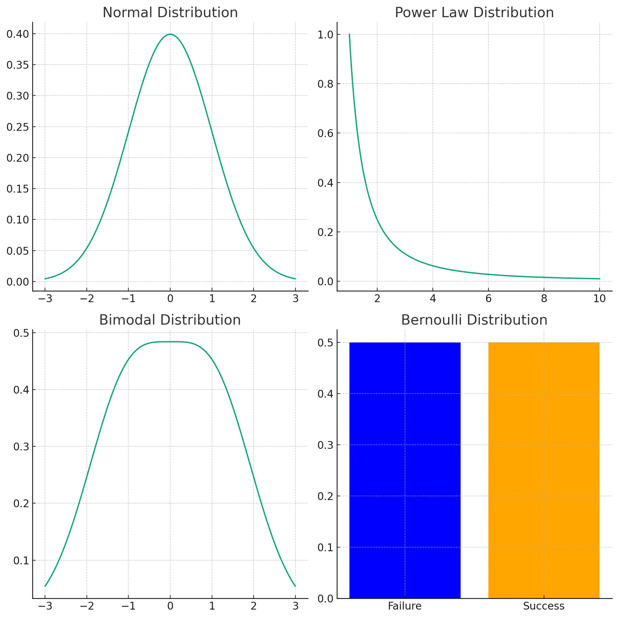
More generally, there are many interesting real world phenomena that are not normally distributed:
- Power Law Distribution: a “fat tail” of fairly uncommon, but not exceedingly rare data points with far more extreme magnitude than the majority of cases. Examples include returns to venture capital investment, populations of cities, word frequencies in natural languages, distribution of wealth in societies.
- Bimodal Distribution: two distinct clusters or peaks. Examples include human reaction times, sizes of different sexes of a species, scores on a difficult exam.
- Bernoulli Distribution: binary yes/no outcomes. Examples include the number of heads in 10 coin flips, number of defective products in a batch, patient recovery rates.

The shape of common probability distributions.
We won’t go into the details of each of these distributions here, suffice it to say you should learn how your data is distributed and what the characteristics of that distribution are if you want to be able to intelligently analyze that data.
Decompress
In The Big Short Michael Burry asks his new hire for data on the individual mortgages making up popular residential mortage-backed securities. Burry proceeded to analyze the raw mortgage data rather than take at face value the summary info provided about the set of mortgages as a whole.
Mortgage-backed securities were a kind of abstraction over a set of mortgages, a conceptual compression of thousands or loans made to individuals, and Burry decompressed that abstraction in order to deeply understand what was going on.
What I hope you take away from this post is the tradeoff inherent in using metrics. They are useful as succinct communicators of complex concepts, and in that role can help keep organizations aligned and busy people informed.
But we must be careful not to view the conceptually compressed metric as equivalent to the messy underlying thing.
When trying to better understand your metrics or sudden changes in them my advice is to decompress them. Unsimplify them in order to understand what’s going on.
Look at the shape of the data and ask where that shape comes from.
Look at outliers and typical cases, and examine the details or people behind a few of each.
Gain a nuanced, qualitative feel for the things your metrics represent and you’ll better understand what they really mean.
That’s perhaps the most valuable thing a metric can give you: a signal to seek additional context.